


Why Mobile Responsiveness Is Crucial for SEO Success
Mobile responsiveness improves user experience and keeps visitors engaged across all devices. A responsive website ensures speed, clarity, and consistent performance.

Websites that are not Mobile Responsive can disrupt user engagement and reduce overall digital effectiveness. Text that is difficult to read, buttons that are hard to tap, and layouts that do not adjust properly can lead visitors to leave before completing important actions. Slow-loading pages or inconsistent display across devices further weaken the user experience.
For businesses, this can lower conversion rates, reduce user satisfaction, and affect the credibility of the brand. A website that is fully responsive ensures smooth navigation, clear content presentation, and a consistent experience across all devices, helping maintain engagement and achieve business goals.
What Is Mobile Responsiveness?
Mobile Responsiveness means a website adjusts its layout, content, and images to fit different screen sizes.
-
Automatic Scaling: Text, buttons, and menus resize to match smaller screens.
-
Easy Navigation: Users can browse without zooming, scrolling sideways, or struggling with buttons.
-
Consistent Display: Content looks clear and organized on phones, tablets, or any device.
Why It Is Important
-
Search engines and users prefer websites that work well on all devices.
-
Non-responsive websites may show broken layouts, slow loading, or higher exit rates.
-
Responsive websites keep content readable and encourage visitors to explore more pages.
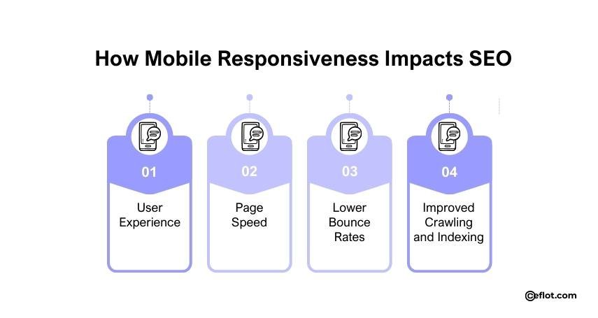
How Mobile Responsiveness Impacts SEO
-
User Experience: A responsive website gives visitors an easy and smooth experience. When users can quickly find information, they stay longer on the page, which search engines notice. This directly improves website ranking in search results. Mobile Responsiveness ensures that navigation is simple, text is readable, and forms are easy to fill on small devices.
-
Page Speed: Mobile-responsive websites often load faster on smartphones. Speed is a critical ranking factor because slow-loading pages frustrate users. Websites optimized for mobile devices use compressed images, clean layouts, and fast-loading scripts to enhance speed. A fast website increases engagement and reduces bounce rates.
-
Lower Bounce Rates: Users leave sites that are hard to navigate or display poorly on mobile. Mobile Responsiveness reduces bounce rates because content is readable, buttons are tappable, and pages load quickly. A lower bounce rate signals search engines that users are satisfied, boosting SEO performance.
-
Improved Crawling and Indexing: Search engines can crawl responsive websites more efficiently. With proper mobile design, all content is accessible on all devices. Responsive sites do not need separate mobile versions, which reduces errors and duplicate content issues. This makes indexing easier and ensures that all important pages are visible to search engines.
Best Practices for Mobile Responsiveness
-
Flexible Layouts: Use layouts that automatically adjust to screen size. Avoid fixed-width designs that require horizontal scrolling. Flexible grids and CSS media queries help your website adapt to all screen sizes, improving both usability and SEO.
-
Readable Fonts: Check whether the text is large enough to read without zooming. Font size and line spacing should be optimized for small screens. Clear typography improves user experience and encourages visitors to stay longer on your website.
-
Clickable Buttons: Buttons and links should be easy to tap on small screens. Avoid placing clickable elements too close together, which can frustrate users. Well-spaced, responsive buttons improve navigation and interaction.
-
Optimized Images: Large image files can slow down mobile performance. Compress images without reducing quality to improve load times. Properly scaled images maintain the visual appeal while enhancing Mobile Responsiveness.
-
Avoid Pop-ups: Large pop-ups can block content and frustrate users. Search engines may also penalize websites with intrusive pop-ups on mobile. Use small, non-intrusive banners instead, or avoid pop-ups entirely to maintain smooth navigation.
-
Use Browser-Friendly Features: Avoid plugins that do not work on mobile browsers. Features like Flash may not be supported on smartphones. Stick to HTML5 and responsive scripts to ensure content is accessible.
-
Test Navigation Flow: Make sure menus, dropdowns, and forms work properly on mobile devices. Test on multiple devices and browsers to verify functionality. A smooth navigation flow keeps visitors engaged and reduces exit rates.
Tools to Check Mobile Responsiveness
You can test how your website performs on mobile devices using online tools. Google’s Mobile-Friendly Test and PageSpeed Insights provide feedback and suggestions. These tools help identify issues that may affect Mobile Performance and SEO performance.
-
BrowserStack: Test websites on multiple mobile devices and browsers.
-
Responsinator: Preview how your site looks on different screen sizes.
-
GTmetrix: Analyze site speed and performance on mobile.
Regular testing helps your site maintains Mobile Responsiveness, which is critical for both SEO and user satisfaction.
The Role of Mobile Responsiveness in SEO Strategy
-
Improved Rankings: Search engines like Google use mobile first indexing. This means Google primarily uses the mobile version of your website to rank pages. If your site is not responsive, your rankings may suffer, even if your desktop version is excellent.
-
Better Engagement Metrics: Engagement metrics like time on site, pages per session, and bounce rate are directly influenced by Mobile Responsiveness. Responsive sites encourage longer visits and repeated visits, sending positive signals to search engines.
-
Reduced Duplicate Content Issues: Non-responsive sites sometimes have separate mobile versions, creating duplicate content. Responsive design uses a single URL for all devices, avoiding duplicate content problems and improving SEO efficiency.
-
Local SEO Advantages: Mobile users often search for services or products nearby. A responsive website with proper mobile optimization improves local SEO visibility. Users can quickly find location information, contact details, and directions without frustration.
-
Voice Search Optimization: Many mobile users rely on voice search. Responsive websites with structured content and fast loading times are more likely to appear in voice search results.
Common Mistakes That Affect Mobile Responsiveness
-
Ignoring Mobile Users: Some websites focus only on desktop design, leaving mobile users with poor experience.
-
Slow Load Times: Heavy scripts and unoptimized images reduce speed.
-
Non-Responsive Media: Videos or images that don’t adjust to mobile screens frustrate visitors.
-
Overlapping Buttons or Text: Crowded layouts reduce usability and engagement.
-
Neglecting Testing: Websites not tested on multiple devices may have hidden issues that hurt SEO.
Avoiding these mistakes ensures your website delivers a smooth mobile experience and improves search performance.
A mobile-responsive website keeps visitors engaged and improves overall website performance. Clear layouts, readable text, and smooth navigation make it easier for users to interact. Focusing on Mobile Responsiveness helps maintain credibility, usability, and consistent results across all devices.
Digital Marketing services in Other Locations in India
Bangalore | Hyderabad | Chennai | Pune | Ahmedabad | Coimbatore | Mumbai | Kolkata | Patna | Amritsar | Indore | Kozhikode | Trivandrum | Jaipur | Nagpur | Gwalior | Dehradun | Noida | Vizag | Raipur | Agra | Gurgaon | Madurai | Udaipur | Thrissur |